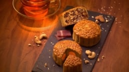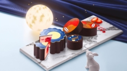
Mid-Autumn 2017
Godiva
Helping Godiva celebrate the Mid-Autumn Festival with festive packaging design.
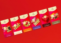
Each year renowned Chocolatier, Godiva, releases limited-edition celebratory chocolates for the Mid-Autumn festival. DASH was commissioned with art direction and packaging design to create a unique design for the brand’s chocolate boxes, gift vouchers and festival marketing.
Godiva
Mid-Autumn 2017
Helping Godiva celebrate the Mid-Autumn Festival with festive packaging design.
Each year renowned Chocolatier, Godiva, releases limited-edition celebratory chocolates for the Mid-Autumn festival. DASH was commissioned with art direction and packaging design to create a unique design for the brand’s chocolate boxes, gift vouchers and festival marketing.
sector
food and beverage
work
art direction / packaging design
sector
food and beverage
work
art direction / packaging design
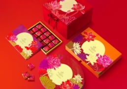
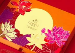
Challenge.
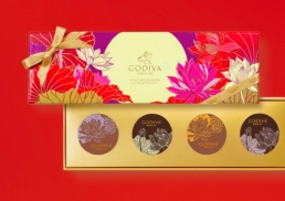
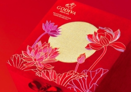
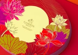
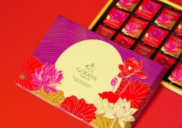
DASH leveraged two popular symbols of the Mid-Autumn festival to form the base of the design. The moon is a symbol of family reunion for the festival and an emblem of happiness and fulfilment. DASH paired the moon with a lotus flower, a symbol of abundance and good fortune. Together these symbols communicate Godiva’s good wishes for its customers and, as its chocolates are often gifted to friends, family and colleagues, ensure that Godiva products help to spread the festival’s good cheer.
Design &Creative Direction.
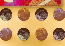
For the design, DASH chose a simple illustrated style for both the moon and lotus. As the form and shape of the illustrations are not overburdened by too much detail, the focus remains on the visual expression of the message of these symbols and the spirit of the festival itself.
To give the packaging an eye-catching and modern feel, DASH ensured the design’s colour palette was impactful to help it stand out from competitor brands and other limited edition gifting series. DASH moved away from the traditional colours of the Mid-autumn Festival, such as red, for a more modern and unique take. The purple, orange and shocking pink of the design is blended with hints of gold, for an eye-catching yet luxurious and modern look that would make the series ideal for gifting.
Challenge.
DASH leveraged two popular symbols of the Mid-Autumn festival to form the base of the design. The moon is a symbol of family reunion for the festival and an emblem of happiness and fulfilment. DASH paired the moon with a lotus flower, a symbol of abundance and good fortune. Together these symbols communicate Godiva’s good wishes for its customers and, as its chocolates are often gifted to friends, family and colleagues, ensure that Godiva products help to spread the festival’s good cheer.
Design &Creative Direction.
For the design, DASH chose a simple illustrated style for both the moon and lotus. As the form and shape of the illustrations are not overburdened by too much detail, the focus remains on the visual expression of the message of these symbols and the spirit of the festival itself.
To give the packaging an eye-catching and modern feel, DASH ensured the design’s colour palette was impactful to help it stand out from competitor brands and other limited edition gifting series. DASH moved away from the traditional colours of the Mid-autumn Festival, such as red, for a more modern and unique take. The purple, orange and shocking pink of the design is blended with hints of gold, for an eye-catching yet luxurious and modern look that would make the series ideal for gifting.