20th Anniversary
Puyi Optical
Puyi Optical is a leading eyewear brand renowned for its highly-personalized eyewear products. They recently celebrated their 20th founding anniversary. DASH was asked to develop a creative vision that could champion Puyi’s decades of reliability while simultaneously thanking their patrons for placing their trust and eye health with Puyi. DASH headed the art direction for the company, enabling them to usher in their 21st year with a cultured, polished and warm branding.
sector
luxury goods
work
design concept / brand identity design / art direction / print design / out-of-home advertisement design / video production and editing / motion graphic design / 3D model & motion design
Puyi Optical
20th Anniversary
Puyi Optical is a leading eyewear brand renowned for its highly-personalized eyewear products. They recently celebrated their 20th founding anniversary. DASH was asked to develop a creative vision that could champion Puyi’s decades of reliability while simultaneously thanking their patrons for placing their trust and eye health with Puyi. DASH headed the art direction for the company, enabling them to usher in their 21st year with a cultured, polished and warm branding.
sector
luxury goods
work
design concept / brand identity design / art direction / print design / out-of-home advertisement design / video production and editing / motion graphic design / 3D model & motion design
photo credit: https://www.facebook.com/PuyiOptical
CHALLENGE.
For two decades, Puyi Optical has been one-stop shopping destination for eyewear, for the entire family. During this time, Puyi Optical has been vocal – in words and actions – of its dedication towards offering personalized optometric experiences. To celebrate its 20th Anniversary, Puyi Optical wanted to showcase their brand image of sagacity, trustworthiness and maturity, along with their passion for optometry, to their customers. The challenge lay in translating this brand identity design to prospects and patrons who have recently associated with the brand and have not been part of its two decades journey. There was also an added challenge of repositioning Puyi’s branding from a local player to a brand with an international appeal.
DESIGN AND CONCEPT.
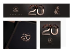
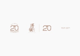
DASH focused on championing the decades worth of faith that customers had built about Puyi Optical. The primary design used for branding was inspired by Puyi’s signature eyewear, the Hawksbill Turtle.
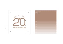
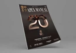
The light bronze color of the numbers and letters was offset beautifully against the black background, creating an air of sensible luxury. The choice of the Hawksbill Turtle design was also made to evoke the longevity and dependability of the brand – symbolic of the real lifespan and personality of the namesake animals.
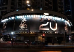
The design also comprised of a 3D representation of the number “20”, to celebrate the brand’s 20th anniversary while also evoking its depth of concern for customers. The top half of the number 20 was colored in the same bronze-black patchwork of a Hawksbill Turtle shell. The latter half was pure and smooth bronze – representing Puyi Optical’s phenomenal transformation from a local family brand to a trusted brand of global repute.
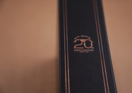
The art direction included not just print/design collaterals, but also a 20th Anniversary special eyewear cleaning cloth – done in jet black with a bronze colored 20 on it. There was also a premium eyeglass box in the same brand identity design, including the name of the company and year of inception.
DASH also developed marketing collateral in the form of a video for show online and offline. The video traced the design of the logo, against a simple, monochrome black background. The same image was used to grace the cover of the Apex Manual magazine and billboards.
By the end of the campaign, DASH was able to create the aesthetic and feel of affordable luxury – representing Puyi Optical’s premium eyewear, that was accessible to anyone who valued quality and design.
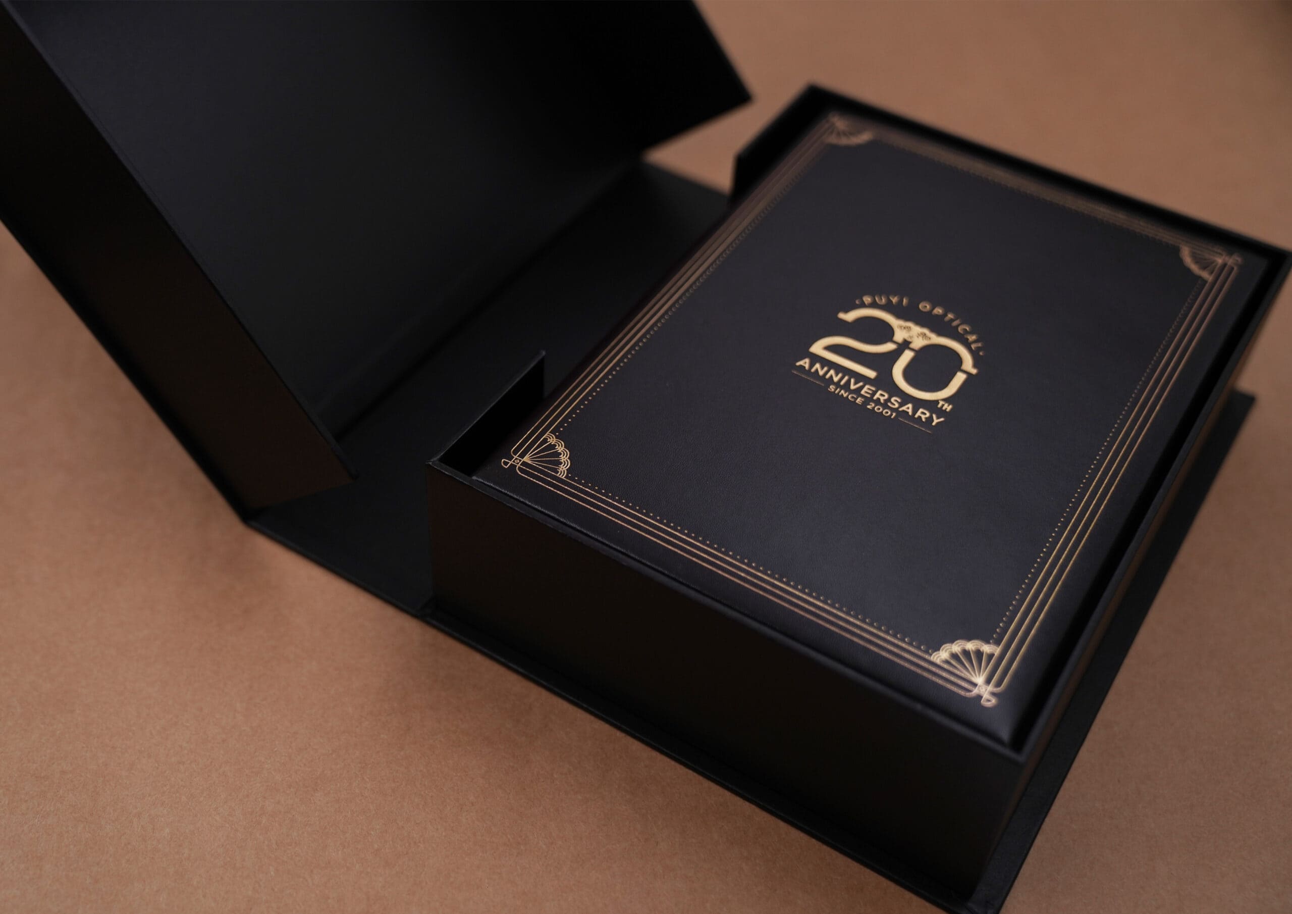
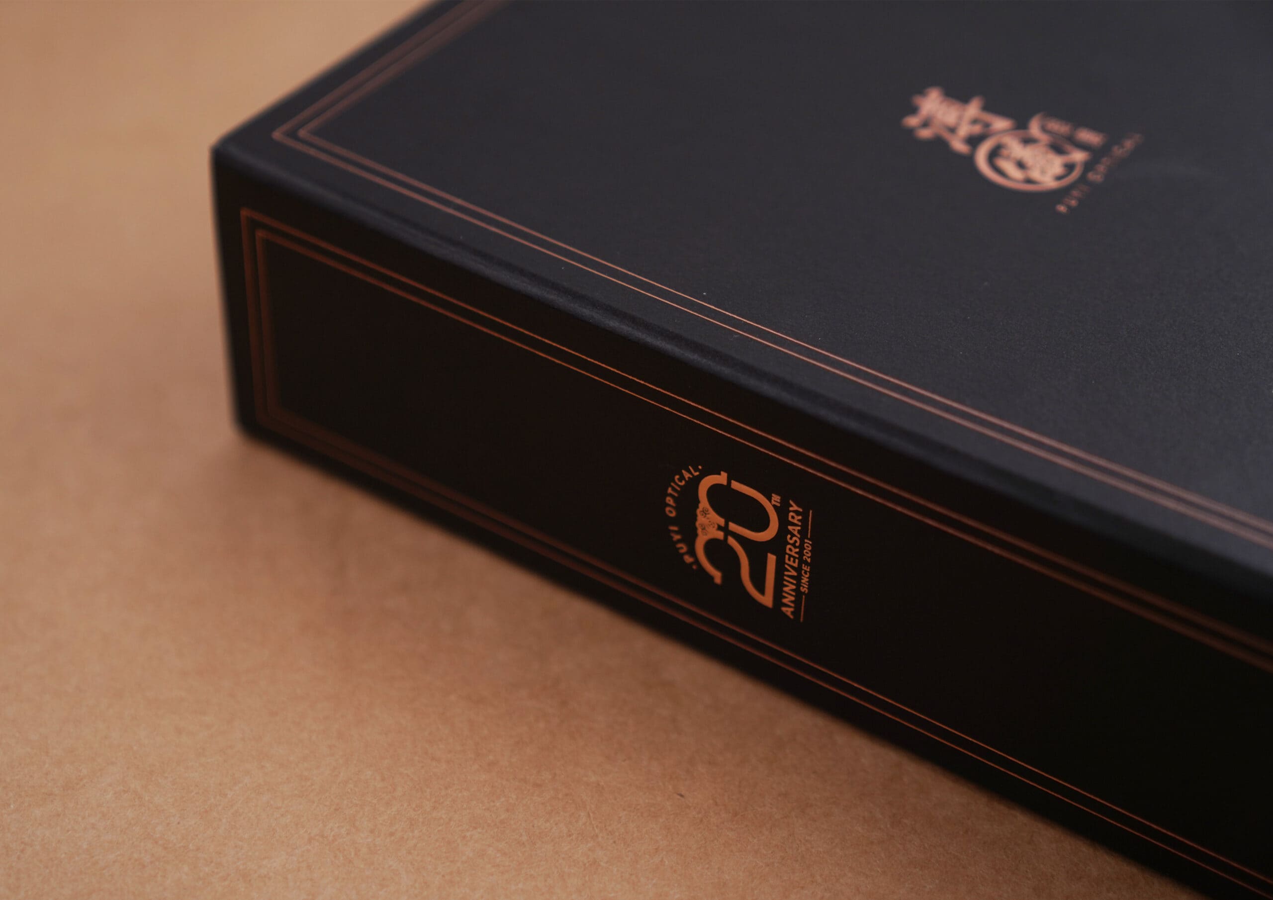
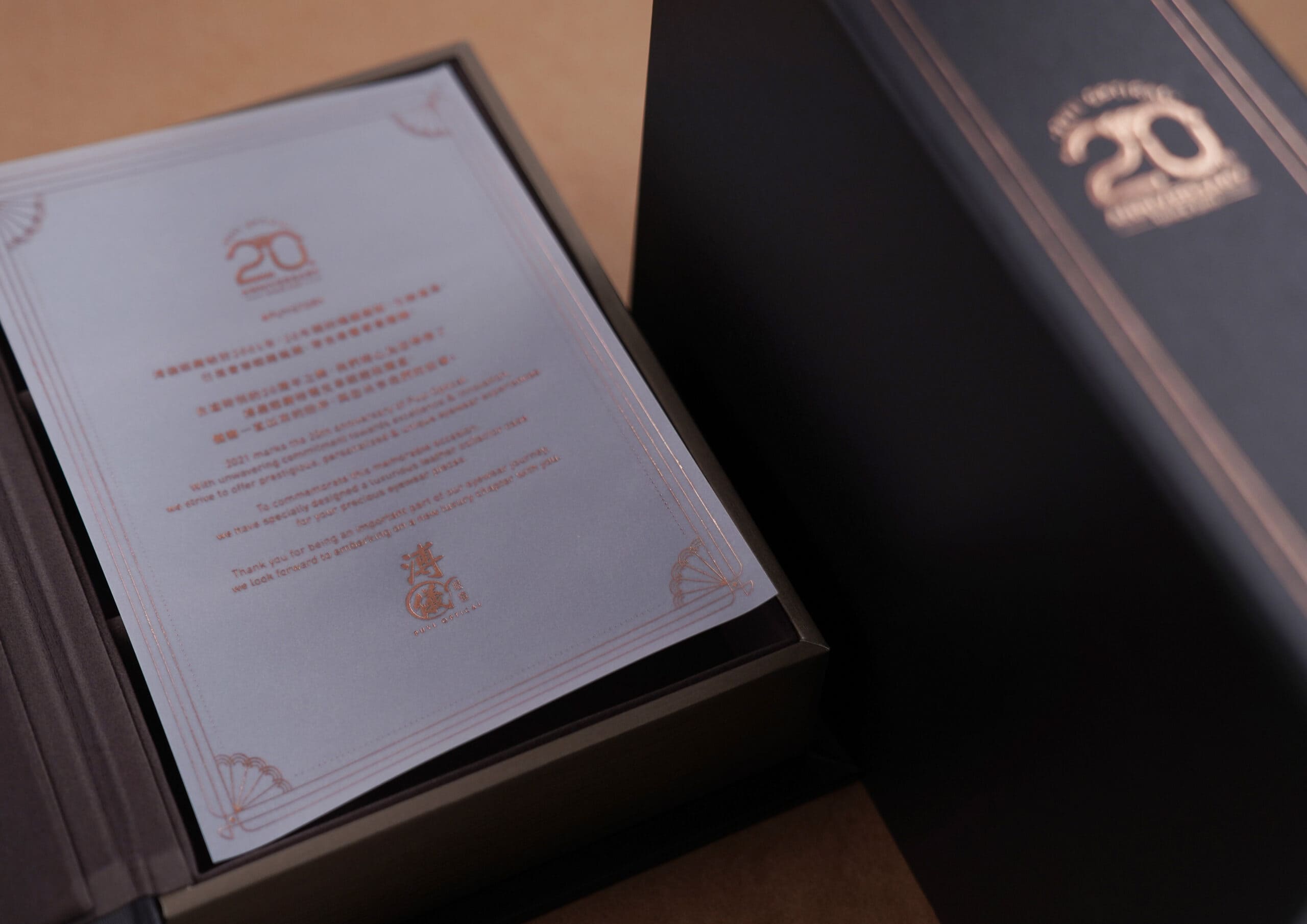
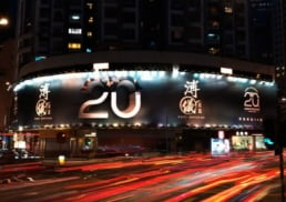
photo credit: https://www.facebook.com/PuyiOptical
CHALLENGE.
For two decades, Puyi Optical has been one-stop shopping destination for eyewear, for the entire family. During this time, Puyi Optical has been vocal – in words and actions – of its dedication towards offering personalized optometric experiences. To celebrate its 20th Anniversary, Puyi Optical wanted to showcase their brand image of sagacity, trustworthiness and maturity, along with their passion for optometry, to their customers. The challenge lay in translating this brand identity design to prospects and patrons who have recently associated with the brand and have not been part of its two decades journey. There was also an added challenge of repositioning Puyi’s branding from a local player to a brand with an international appeal.
DESIGN AND CONCEPT.
DASH focused on championing the decades worth of faith that customers had built about Puyi Optical. The primary design used for branding was inspired by Puyi’s signature eyewear, the Hawksbill Turtle.
The light bronze color of the numbers and letters was offset beautifully against the black background, creating an air of sensible luxury. The choice of the Hawksbill Turtle design was also made to evoke the longevity and dependability of the brand – symbolic of the real lifespan and personality of the namesake animals.
The design also comprised of a 3D representation of the number “20”, to celebrate the brand’s 20th anniversary while also evoking its depth of concern for customers. The top half of the number 20 was colored in the same bronze-black patchwork of a Hawksbill Turtle shell. The latter half was pure and smooth bronze – representing Puyi Optical’s phenomenal transformation from a local family brand to a trusted brand of global repute.
The art direction included not just print/design collaterals, but also a 20th Anniversary special eyewear cleaning cloth – done in jet black with a bronze colored 20 on it. There was also a premium eyeglass box in the same brand identity design, including the name of the company and year of inception.
DASH also developed marketing collateral in the form of a video for show online and offline. The video traced the design of the logo, against a simple, monochrome black background. The same image was used to grace the cover of the Apex Manual magazine and billboards.
By the end of the campaign, DASH was able to create the aesthetic and feel of affordable luxury – representing Puyi Optical’s premium eyewear, that was accessible to anyone who valued quality and design.