Chinese New Year 2018
Helping luxury chocolatier Godiva share the Chinese New Year feeling with print and packaging design and food and photography styling.
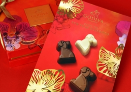
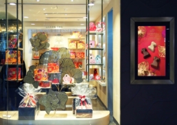
Godiva, the world-renowned chocolatier, wanted to celebrate Chinese New Year with a limited-edition selection that would commemorate the Year of the Dog. Godiva hired DASH to undertake the art direction, print and packaging design, food styling and photography as well as copywriting, window display design and point-of-sale design for Spring Festival collection.
sector
food and beverage
work
art direction / print design / packaging design / food styling / food photography / copywriting / printing and production / window display design / point-of-sale material design
Chinese New Year 2018
sector
food and beverage
work
art direction / print design / packaging design / food styling / food photography / copywriting / printing and production / window display design / point-of-sale material design
Challenge.
While the individual chocolates for the limited edition were in the shape of a dog, the client wanted to move beyond this adding a complementary element that brought the spirit of the season to life. As Godiva is a luxury chocolate brand, the design needed to communicate a sense of luxury and be appealing enough to be considered the perfect item for gifting.
Design &Creative Direction.
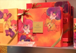
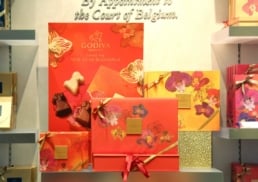
DASH wanted to create a design that blended modern elements with the traditional spirit of the Chinese New Year. DASH explored a number of approaches and icons associated with the holiday and decided to base the creative design around the orchid flower. Delicate and exotic as well as sophisticated and luxurious, the orchid was not only an auspicious icon, but strongly adhered to Godiva’s core brand message and positioning.
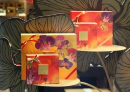
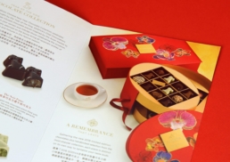
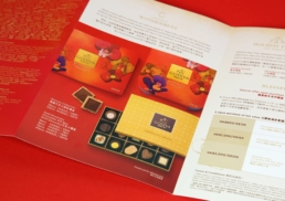
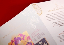
For the packaging design, the illustrated flowers were complemented by a watercolour-style. Watercolour helps to create a sense of elegance, and a carefully chosen red and yellow colour pallet adhered to Godiva’s brand style while enhancing the festival’s message. Red was an obvious choice because it is the key colour associated with Chinese New Year and helps to communicate prosperity and wealth. Yellow is a colour of happiness and optimism, as well as good luck, and worked nicely to communicate the Chinese New Year and fresh beginning that the festival holds. Golden outlines were added to enhance the luxury feeling and add to the chocolates’ appeal as a product to gift.
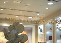
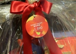
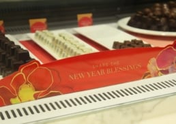
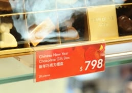
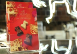
The key orchid design was applied to all product packages as well as in window displays and point-of-sale. Metallic gold props representing the flower’s petals were used as eye-catching elements in the displays and as props during the food photography and styling.
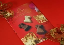
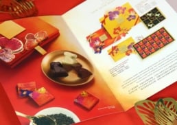
For the limited edition’s brochure, the food styling aimed to create a luxurious yet positive mood. The mood of the photo communicates a bright and happy setting, such as the feeling of sharing special moments with loved ones during the Chinese New Year. As well as making the chocolates the focus in certain shots, DASH was sure to bring in elements of the packaging to show the overall feel of the limited edition chocolates and the luxury and attention to detail that makes them the perfect gift for the season.


