Mid-Autumn 2018
Godiva
Creating the visual identity, design and packaging for Godiva’s Mid-Autumn Festival limited-edition chocolates.
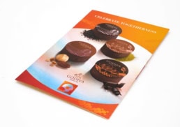
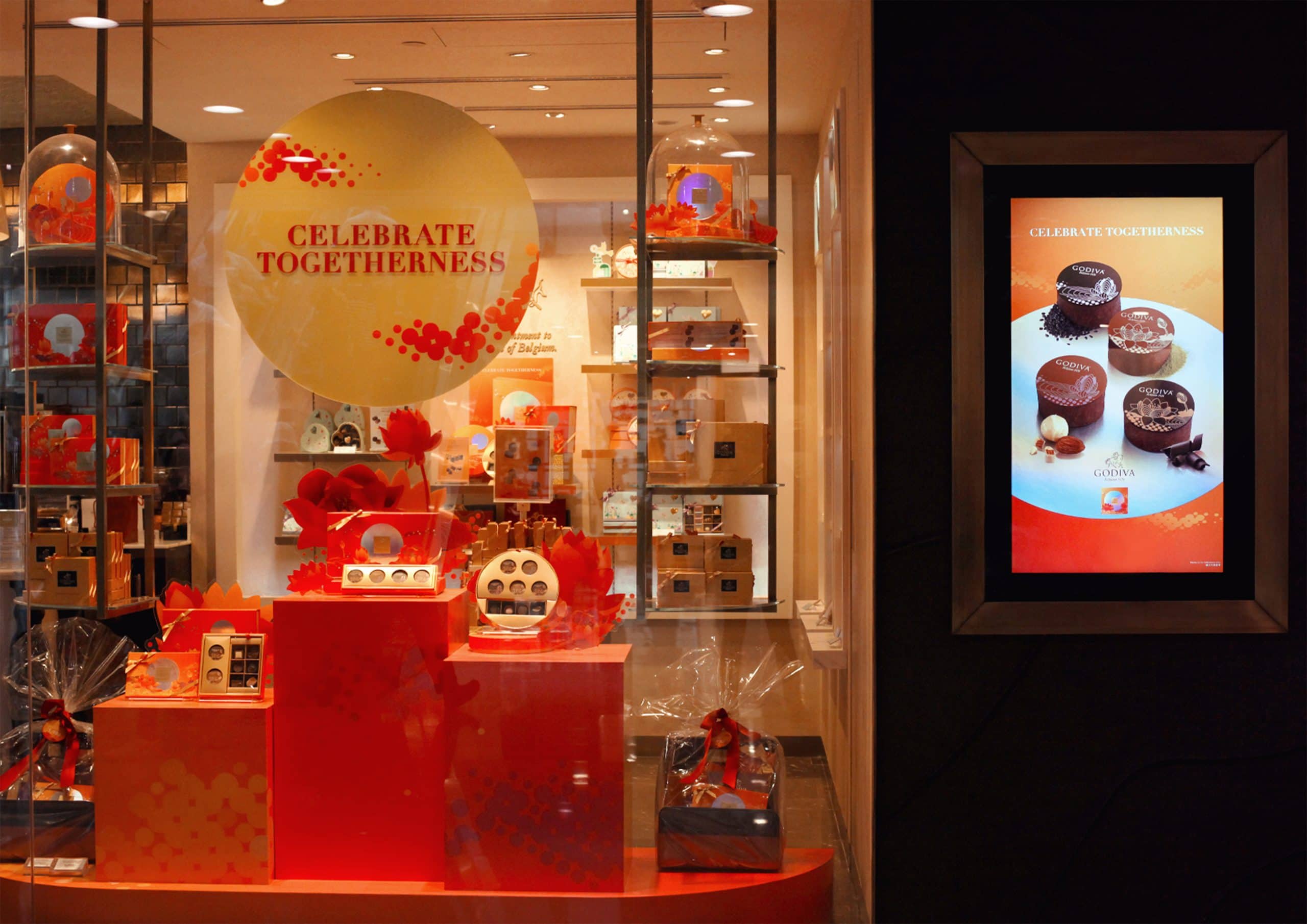
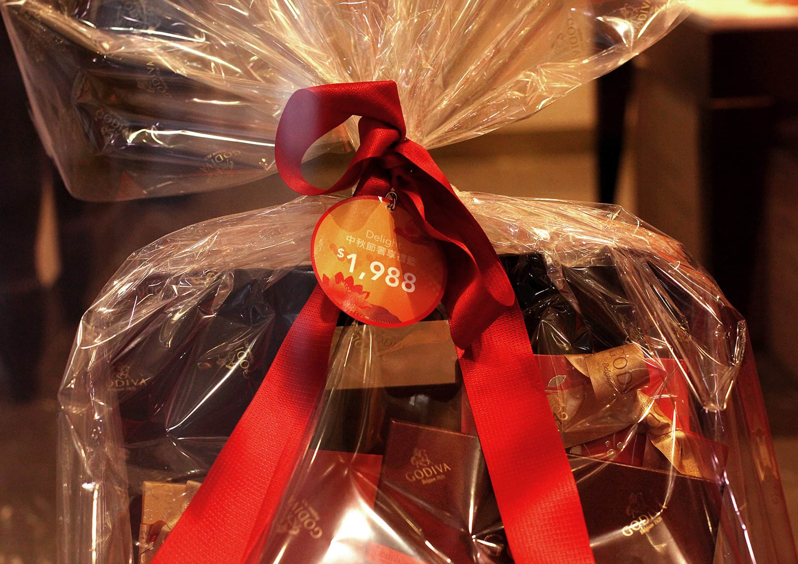
With the Mid-Autumn Festival approaching, world-renowned Chocolatier, Godiva, was looking for a way to promote and position its limited-edition celebratory chocolates for this popular Chinese holiday. DASH created a unique visual identity and provided design and packaging for the chocolatier’s festival product range.
sector
food and beverage
work
creative direction / art direction / key visual / print design / packaging design / food styling / food photography / copywriting / printing and production / window display design / point-of-sale material design
Godiva
Mid-Autumn 2018
Creating the visual identity, design and packaging for Godiva’s Mid-Autumn Festival limited-edition chocolates.
With the Mid-Autumn Festival approaching, world-renowned Chocolatier, Godiva, was looking for a way to promote and position its limited-edition celebratory chocolates for this popular Chinese holiday. DASH created a unique visual identity and provided design and packaging for the chocolatier’s festival product range.
sector
food and beverage
work
Challenge.
Gifting is a popular tradition of the Mid-Autumn festival. With many chocolate and food and beverage brands creating limited-edition series in celebration, DASH needed to ensure that Godiva’s offering would stand out from the crowd while communicating the right message for the Mid-Autumn Festival.
Creative Direction &Design.
Godiva wanted to position its offering in a way that would combine the traditional elements of the festival with a touch of modernity to appeal to a wide range of customers that undertake gifting to their families, colleagues and acquaintances.
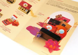
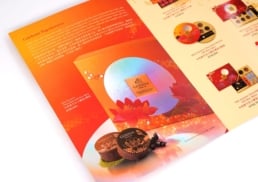
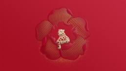
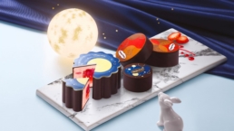
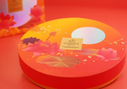
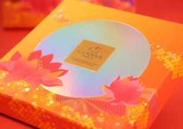
DASH undertook a range of research on the origins of the Mid-Autumn Festival, its key symbols and their meaning. For the packaging design, DASH drew on the lotus flower, a symbol of good fortune during the festival. To add a modern touch to this traditional symbol, DASH added a geometric line design to the illustration of the lily pads. The thin wavy lines bring the shape of the lily pads to life and emphasise their natural and organic form. The lives also serve to add texture to the scene, and the stable geometry of the lines gives the scene an ethereal feeling to the design.
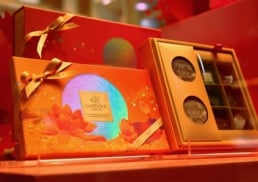
To emphasise the modern feel and help the packaging stand out, DASH used a colour gradient, blending a sharp orange with a vibrant red. The memorable and eye-pleasing colour scheme is further enhanced with a moon created from laser foil at the centre of the image. The reflective and iridescent quality of the laser foil gives the impression of reflecting light from a bright moon of the Mid-Autumn Festival and complements the graphic treatment of the packaging.


Challenge.
Gifting is a popular tradition of the Mid-Autumn festival. With many chocolate and food and beverage brands creating limited-edition series in celebration, DASH needed to ensure that Godiva’s offering would stand out from the crowd while communicating the right message for the Mid-Autumn Festival.

Creative Direction &Design.
Godiva wanted to position its offering in a way that would combine the traditional elements of the festival with a touch of modernity to appeal to a wide range of customers that undertake gifting to their families, colleagues and acquaintances.
DASH undertook a range of research on the origins of the Mid-Autumn Festival, its key symbols and their meaning. For the packaging design, DASH drew on the lotus flower, a symbol of good fortune during the festival. To add a modern touch to this traditional symbol, DASH added a geometric line design to the illustration of the lily pads. The thin wavy lines bring the shape of the lily pads to life and emphasise their natural and organic form. The lives also serve to add texture to the scene, and the stable geometry of the lines gives the scene an ethereal feeling to the design.
To emphasise the modern feel and help the packaging stand out, DASH used a colour gradient, blending a sharp orange with a vibrant red. The memorable and eye-pleasing colour scheme is further enhanced with a moon created from laser foil at the centre of the image. The reflective and iridescent quality of the laser foil gives the impression of reflecting light from a bright moon of the Mid-Autumn Festival and complements the graphic treatment of the packaging.